您现在的位置是:网站首页> 编程资料编程资料
css用Flex布局制作简易柱状图的实现深入浅析CSS3中的Flex布局整理CSS实现动态图片的九宫格布局的实例代码css之display属性之inline-block布局实现详解详解CSS中的flex布局使用CSS和Java来构建管理仪表盘布局的实例代码
 2023-10-18
394人已围观
2023-10-18
394人已围观
简介 这篇文章主要介绍了css用Flex布局制作简易柱状图的实现,文中通过示例代码介绍的非常详细,对大家的学习或者工作具有一定的参考学习价值,需要的朋友们下面随着小编来一起学习学习吧
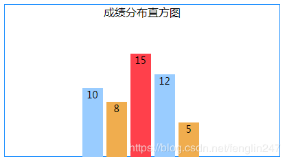
以下是一个用Flex布局的柱状图:
HTML:
成绩分布直方图10815125
CSS:
.his_box{ /*盒子*/ width: 400px; height: 220px; border: solid 1px #1E90FF; display: flex; flex-direction: column; align-items: center; } .histogram{ /*直方图*/ display: flex; } .histogram>div{ /*一条图块*/ width: 30px; height: 200px; /*100%时的块高度*/ font-size: 14px; text-align: center; margin-right: 5px; display: flex; flex-direction: column-reverse; } .histogram>div:nth-child(3n) div{ /*图块颜色*/ background-color: #ff404b; } .histogram>div:nth-child(3n+1) div{ background-color: #99CCFF; } .histogram>div:nth-child(3n+2) div{ background-color: #F0AD4E; } .histogram>div:nth-child(1) div{ flex: 0 0 50%; /*20为100%,50%就是10*/ } .histogram>div:nth-child(2) div{ flex: 0 0 40%; /*8/20*/ } .histogram>div:nth-child(3) div{ flex: 0 0 75%; /*15/20*/ } .histogram>div:nth-child(4) div{ flex: 0 0 60%; /*12/20*/ } .histogram>div:nth-child(5) div{ flex: 0 0 25%; /*5/20*/ }本例中,图块的最高点为20,每条柱子的高度按比例定义:第1条数据为10,高度是50%;第2条数据为8,高度为40%,以此类推。
图块颜色采用3色循环使用。
布局时,最外层容器使用了align-items: center;使容器内元素整体居中。
直方图模块使用了display: flex;让模块中的柱子横向排列。
每条柱子也是flex模块,但它的布局方向是纵向的,且方向是从下到上的 flex-direction: column-reverse;
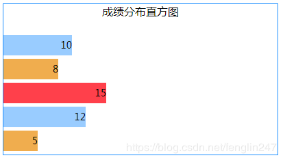
如果想做成纵向排列的直方图:
CSS:
.his_box{ /*盒子*/ width: 400px; height: 220px; border: solid 1px #1E90FF; display: flex; flex-direction: column; justify-content: space-between; } .his_box>div{ text-align: center; } .histogram{ /*直方图*/ display: flex; flex-direction: column; } .histogram>div{ /*一条图块*/ height: 30px; width: 200px; /*100%时的块宽度*/ line-height: 30px; font-size: 14px; text-align: right; margin-bottom: 5px; display: flex; } .histogram>div:nth-child(3n) div{ /*图块颜色*/ background-color: #ff404b; } .histogram>div:nth-child(3n+1) div{ background-color: #99CCFF; } .histogram>div:nth-child(3n+2) div{ background-color: #F0AD4E; } .histogram>div:nth-child(1) div{ flex: 0 0 50%; /*20为100%,50%就是10*/ } .histogram>div:nth-child(2) div{ flex: 0 0 40%; /*8/20*/ } .histogram>div:nth-child(3) div{ flex: 0 0 75%; /*15/20*/ } .histogram>div:nth-child(4) div{ flex: 0 0 60%; /*12/20*/ } .histogram>div:nth-child(5) div{ flex: 0 0 25%; /*5/20*/ }到此这篇关于css用Flex布局制作简易柱状图的实现的文章就介绍到这了,更多相关css柱状图内容请搜索以前的文章或继续浏览下面的相关文章,希望大家以后多多支持!
相关内容
- 利用css样式实现表格中字体垂直居中的方法CSS3 不定高宽垂直水平居中的几种方式CSS3实现水平居中、垂直居中、水平垂直居中的实例代码手把手教你CSS水平、垂直居中的10种方式(小结)css常用元素水平垂直居中方案css布局教程之如何实现垂直居中CSS实现垂直居中的几种方法小结CSS垂直居中的另类实现代码详解(不走寻常路)
- CSS变量实现暗黑模式的示例代码纯CSS免费让网站拥有暗黑模式切换功能的实现代码Html页面支持暗黑模式的实现详解Html5项目适配系统深色模式方案总结
- CSS 中px、em、rem、%、vw、vh单位之间的区别详解浅析CSS中单位px、rem、em、vh、vw之间的区别CSS3移动端vw+rem不依赖JS实现响应式布局的方法css3中单位px,em,rem,vh,vw,vmin,vmax的区别及浏览器支持情况浅析rem和em和px vh vw和% 移动端长度单位如何利用vw+rem进行移动端布局
- css overflow: hidden 的用法(溢出隐藏及清除浮动)CSS 清除浮动与BFC的方法CSS实现元素浮动和清除浮动的方法Css实现清除浮动的方法汇总什么是BFC? CSS 使用伪元素清除浮动的方法轻松搞懂CSS浮动与清除浮动图文详解css 如何清除浮动的示例代码CSS清楚浮动clear:both的实例代码
- 用css3实现转换过渡和动画效果css3+jquery实现的手机app页面转换动画特效源码css实现鼠标放上去时图片过渡转换动画效果
- CSS 返回顶部代码示例css返回顶部图标固定在浏览器右下角且兼容ie6
- css实现抖音订阅按钮动画效果CSS3 水墨风格背景动画按钮基于CSS 属性实现按钮悬停边框和背景动画集合CSS实现菜单按钮动画
- 全民英雄年兽BOSS来袭_关注微信得魔钻奖励_手机游戏_游戏攻略_
- 全民英雄新年祝福礼包_首冲6元即可获得紫卡礼包_手机游戏_游戏攻略_
- 全民英雄敏捷英雄骨弓进化攻略心得_敏捷英雄骨弓怎么进化_手机游戏_游戏攻略_